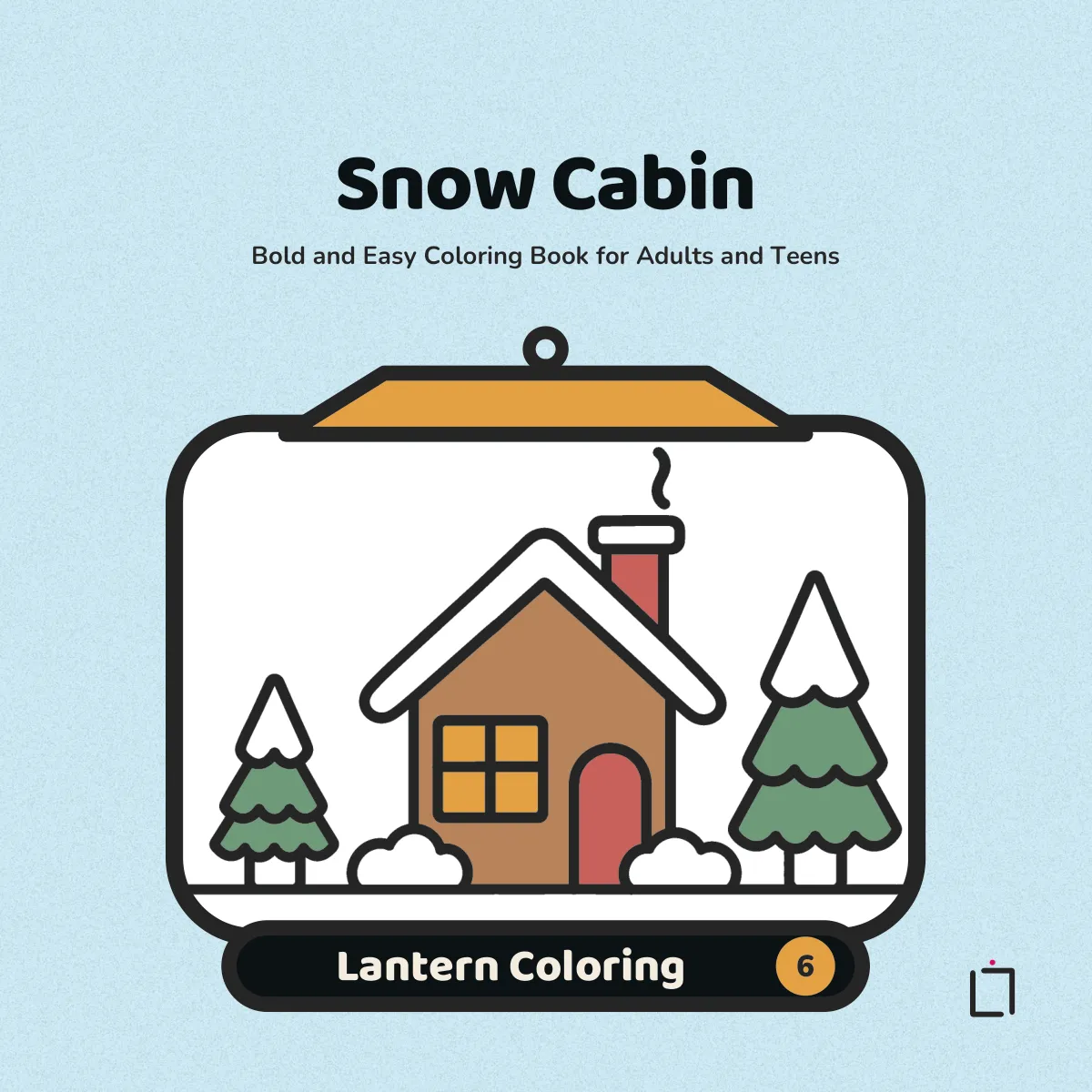
A cozy page is mostly a matter of choosing fewer colors, not better ones. The four ideas behind a calm palette, then twelve palettes in plain words, from cocoa and cream to a winter cabin, and how to try one on a real page.
The four ideas behind a cozy palette
Most pages that look cozy, rather than loud, follow the same few ideas, and the twelve color palette ideas for coloring books below all rest on them. None of the ideas is a rule, and every one of them is easier on a bold and easy page, where the spaces are big and each color shows.
A limited palette. Four or five colors for the whole page, chosen before you start. A box of forty is a pleasure to open and a trap to use: every space gets a new color, and the page ends up busy. With five, the same colors come back in different places, and the repeats are what make a picture hold together.
One warm accent. Most of the page in quieter colors, and one warm color, a lamp yellow, a rust orange, a berry red, used in two or three small places. The eye goes to it first. In a room scene that is usually the light: a lamp, a window, a candle flame.
A light and a dark of one hue. A pale blue and a deep blue, a cream and a caramel. The light one for the side facing the light, the dark one for the shadow side and the gaps. It gives a flat outline drawing some depth without a single new color. With pencils, the same pencil pressed lightly and then harder does the same thing; with markers, a second layer usually goes a little darker.
Leaving white. The paper is a color too. Snow, steam, a highlight on a mug, the pages of an open book: left uncolored, they read as the brightest part of the picture. A page with no white left on it tends to look heavy.
Behind all four is one fact the painter and teacher Josef Albers built a book on: a color is almost never seen as it physically is, because the colors around it change it, which made color, in his words, “the most relative medium in art” (Albers, quoted by the MIT List Visual Arts Center). So a palette is only a palette once the colors are side by side. Test them together on a scrap of paper, or on the test page at the front of the book, before the first space on the page.
Six warm palettes
Warm palettes suit indoor pages: kitchens, reading corners, mugs and baking. Each one below names its colors and the kind of page it suits.
1. Cocoa and cream. Cream, caramel, cocoa brown, and a soft pink as the accent. For a mug of hot chocolate, cookies on a plate, a loaf on a board. All browns, light to dark, so the pink does the work of a warm accent without shouting.
2. Reading lamp. Honey yellow, warm gray, brick red, olive green. For a reading nook or an armchair with a lamp. The yellow goes in the lampshade and the pool of light under it, the gray in the walls, and the red in one cushion or a book spine.
3. Pumpkin patch. Burnt orange, mustard, deep plum, sage green. For pumpkins, fallen leaves, a porch in October. Orange and mustard sit next to each other on the color wheel, which keeps them calm together; the plum is dark enough to hold the shadows.
4. Sage kitchen. Sage green, oatmeal, terracotta, pale butter yellow. For kitchen shelves, jars, potted herbs. Green and terracotta lean toward opposite sides of the wheel, so a little terracotta on a pot or a tile looks bright against the green without clashing.
5. Candlelight. Butter yellow, amber, soft gray, one charcoal. For the quiet pages: a candle, a closed book, a sprig of leaves. Two yellows for the flame and its glow, gray for everything else, and charcoal kept for the one darkest shadow.
6. Berry tea. Raspberry, blush pink, cream, and a deep teal accent. For teacups, cakes, a table set for two. The pinks are a light and a dark of one hue; the teal is the cool note that keeps the pinks from going sweet.
Six cool and quiet palettes
Cool palettes suit windows, rain, evenings and snow. They also suit a page colored late, when you want the picture to settle down rather than wake up. Coloring before bed instead of the phone is about that evening page.
7. Rainy window. Slate blue, pale blue gray, cream, and mustard as the accent. For a window seat, a cat on a sill, rain on the glass. The blues fill the outside, the cream the inside, and a mustard blanket or mug pulls the eye back into the room.
8. Sweet shop pastels. Mint, strawberry pink, vanilla, chocolate brown. For cupcakes, ice cream, a jar of sweets. Pastels are light colors, so they need one dark: the chocolate goes in the shadows and on one or two treats, and the page stops looking washed out.
9. Woodland. Fox orange, moss green, bark brown, cream. For foxes, owls, rabbits, a path through trees. Orange against green is a near opposite pair, so the animal stands out from the forest around it.
10. Christmas without the clash. Deep pine green, cranberry, a gold or mustard, cream. For a tree, stockings, wrapped presents. Darker, softer versions of red and green sit together better than the bright ones, and the gold is the warm accent in the lights and the star.
11. Lavender evening. Lavender, dusty purple, pale peach, warm gray. For a bedroom, a moon in a window, a sleeping animal. Two purples, light and dark, with peach as a small warm note.
12. Snow cabin. Icy pale blue, pine green, warm wood brown, lamp-glow yellow, and the white of the paper. For log cabins, snowy trees, a frozen lake. Almost the whole page is cool, the brown of the logs is the warm middle, and the yellow goes only in the windows, so the cabin looks lit from inside. The snow is the white you leave. This is the palette for the winter volume, Snow Cabin.
Trying a palette on the sample page
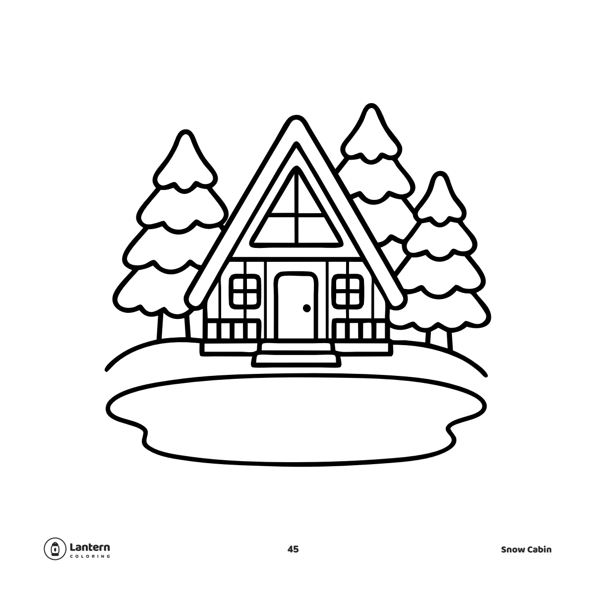
The page above is uncolored, a design from the middle of Snow Cabin, and it is a good one to try palette 12 on. Here is one way to place it:
- The lake: icy pale blue, with the darker blue of a second layer or a firmer press near the far shore.
- The pines: pine green on the branches, with the snow on each tier left white. A few strokes of pale blue under each tier read as shadow on snow.
- The cabin: wood brown on the walls, a darker brown on the roof edge and porch rail.
- The windows: lamp-glow yellow in all three, and nowhere else on the page.
- The ground: white, with a little pale blue along the edge of the lake.
Then try a different palette on the same design: rainy window, or lavender evening. The same page in two palettes is the plainest way to see how much the colors, and not the drawing, set the mood.
Markers, pencils and palettes
A palette is easier to keep when the tools match it. Five markers or five pencils, set out before you start and the rest put away, are a palette you cannot drift from. A broad marker nib covers a big space in fewer strokes than a pencil point, which suits the flat, clean look of a bold page; which markers to choose for that is in the best markers for bold and easy coloring books. With markers, put a sheet of paper behind the page; why that matters is in why markers bleed through a coloring book.
If you own a big set, picking a palette from it is half the fun: lay the five you chose side by side on the test page and look at them together before you commit.
Choosing pages for a palette
Big spaces show a palette best. In a busy, intricate design, a color covers a hundred tiny shapes and you see texture more than color; in a bold design with a few large spaces, each color is one clear area, and a five-color palette reads at a glance. That is part of what a bold and easy coloring book is good for.
The palettes above are matched to themes, and any bold and easy book with those subjects will take them. In our own series, the warm ones suit Cozy Corners and Sweet Treats, the pumpkin patch suits Cozy Fall and Halloween, woodland suits Cute Animals, the Christmas palette suits Cozy Christmas, and the last one was put together for Snow Cabin. The whole Lantern Coloring series is 52 designs a book, one to a right-hand page with the back left blank.
Sources
- MIT List Visual Arts Center. Josef Albers: Interaction of Color. Exhibition page, 2004, quoting Albers on color as “the most relative medium in art”.